Background
Mahara is an open source ePortfolio platform that allows learners to document their evidence, reflect on their learning, and engage with others. Catalyst has been the maintainer and primary development company since the project started in 2006. As maintainers, we look after the project infrastructure and promotion of Mahara.
Opportunity
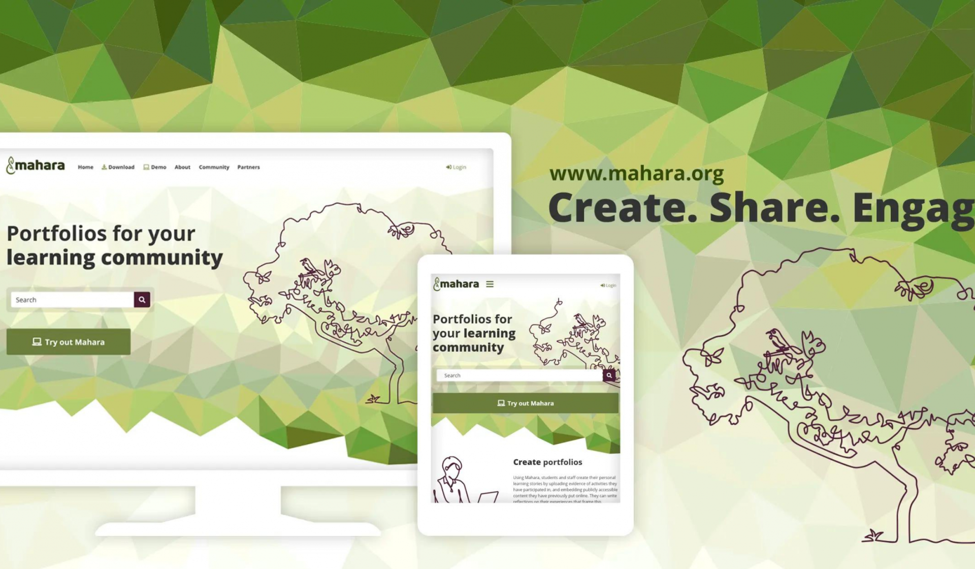
At the beginning of 2017, the Catalyst team went live with a modernised logo for Mahara and established branding guidelines to achieve a consistent look across the community website, marketing material, and the project's official social media presence. Since then, the project has evolved along with the design aesthetics of what contemporary websites could look visually. Five years after the brand refresh of 2017, it was time to update the existing imagery of the Mahara community website. Additionally, a challenge was making the new imagery work in other contexts, such as social media posts, the Mahara manual, and merchandise.
Solution
To start with, the Catalyst design team looked at who the audience for the website was to better support the story that the Mahara team wanted to tell. By doing this, they were able to be more precise about the information on the homepage. Readers are now guided more clearly towards the site's purpose, which is two-fold: to be a landing page for people wanting to learn about the software and those seeking support.
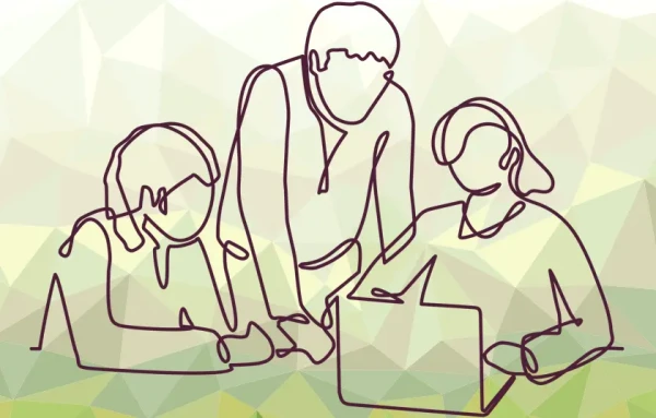
The new imagery emphasises the Mahara motto of 'Create, share, engage' in the light single-line drawings, juxtaposing them with the coloured triangles that bring in branding colours and additional visual interest. Re-designing the homepage was just the start. We will also look at creating graphics for other pages on the site, social media templates, and updating publications and merchandise to reflect this change.


